Why Should You Use Sparklines Inside Salesforce
Sparklines are a data visualization that is often used to display trends inside of a window, and in our case in Salesforce. They are often used to show how an individual metric is trending over time. Salesforce has also been long known for its data visualization and analytics capabilities but not much in the way of inline formula charts such as this. You should care because it's an easy way to get a powerful visual data tool which a bunch of people ask for in your toolkit. With my latest experimenting and bending of Salesforce to my will, I am going to go over Sparklines, which are small charts that can be embedded in any report or dashboard. Salesforce provides a variety of charts and graphs to display data in different formats, based on report data. These charts make it easy for the user to see patterns and trends in the data. The user can choose from bar, pie, area or line charts to visualize the information inside of Report Builder, but sometimes that isn’t needed to go as far as managing report Administration duties.
Sparklines Fill the Gap for Charts in Salesforce
There is one particular benefit to sparklines, and it’s a quick visual indicator of the trend of how a number goes up and down in the course of a series of data. A specific use case is to visualize Search Engine month over month Searches per Month Data, which is what I used this for originally. Sparklines are typically outside of this use case small charts that are used to depict trends in data over a short period of time. They're often used to visualize a trend in sales, but they can be used for any metric. Sparklines are typically drawn as simple, unadorned line graphs that use only the most necessary elements to convey the information.
Salesforce Formula Fields and Visualizing Data
An overlooked simple trick in Salesforce Lightning Experience is IMAGE function exists and can convert your URL into a proper image. Knowing that we can use that IMAGE URL and then also Quickchart.io via a formula Field, we can setup a proto type to see what it would look like if there were 12 months worth of data in fields ready to look at. I Want to Customize it More! Now that you have the mini application with the Sparklines prototype, you can take what the Formula field does and apply it to your use case. The repository linked with the SFDX Project is a deployable project to a scratch org and the Listview will show you your example Sparklines.
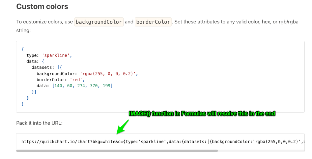
Quickchart.io and Generating Charts on the Fly
I am not going to lie I was amazed when I saw how this service would generate a signicant volume of charts for you via URL, where you pass an object through to the URL like you would see a simple parameter “https://yoursite.com?simple_param=1&(more params)” but using a JSON object in the URL Like {key1:0, key2: 1, key3:2}. This is something you’d typically send as the Body of the payload to an endpoint, not in the URL as a JSON object , but hey it works in this case. So what that means for our integration is a “GET” Request that will hit the quickChart.io endpoiint with our 12 data points.
Slow Down… JSON, Endpoints, APIs .. Distill it Down…
So any service that interacts with other systems online you can think of as an endpoint where data goes to and from. There is a system out there setup by a nice team who made their endpoint take our data and create an image, and return the image data for us to utilize how we please. There are a ton of free APIs out there but ones like this that provide such a substantive value are hard to appreciate enough… they can give a lot of content to use without ever paying a cent to them, which is awesome. So because of their generosity we have a system we can access via Salesforces platform, that will take our data and give us this image, and this post will put it all together in layman terms. By the end I hope you have an installable package that shows the Sparklines setup utilized on an object that you can tweak to your liking.
Use Case:
We will create a set of fields that can be used as a 12 field set for the data points, and store with Custom Metadata. That way we have the option for using the Custom Metadata in any Formula, since "Insert Field" will give us the $CustomMetadata Global Variables to use
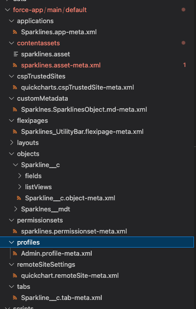
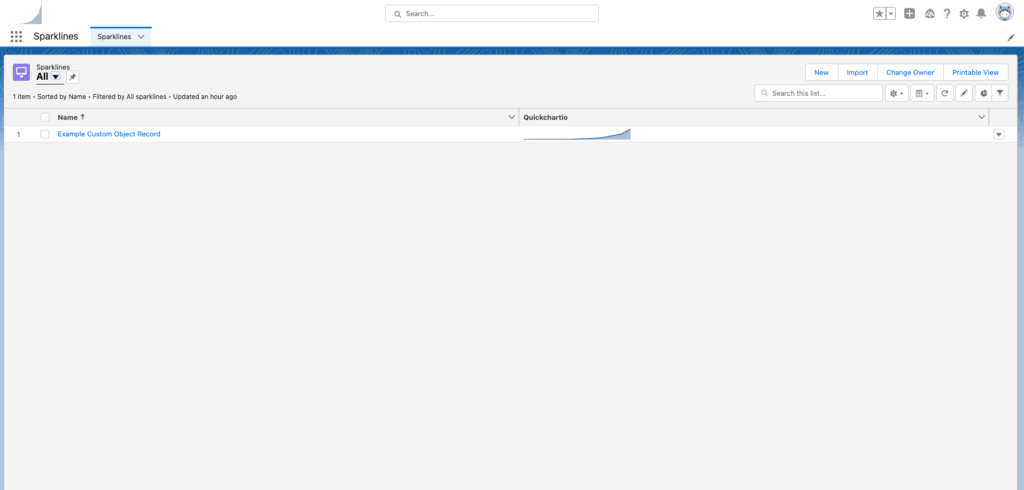
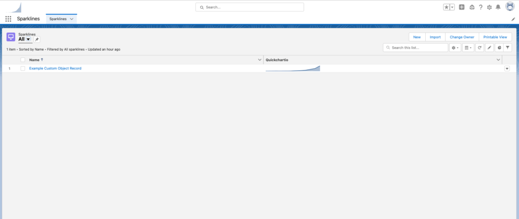
Above is the Working Example you can find in the Repository here
Custom Metadata
There is a Custom Metadata record available to show you how to store 12 months worth of data on the Custom Metadata record and referencing from our formula field:
Formula on Custom Object Sparkline__c
You can see to the right that the Formula Field uses the IMAGE Function which will allow us to display this formula field as an image in Lightning.
App + Tab + Listview
This was a convenience add to make it easy to create a scratch org, and deploy the repo to the scratch org and be able to look at a working example right away.
SFDX Project to Utilize
Located at the link here, the repository is a commit of the source pulled down from Salesforce after successfully implementing. Once you install the links source, you can expect to see the app Sparklines (assign the PermissionSet "Sparkline" to user).
Quickchartio__c Field is the Formula that Contains Image URL etc.
Remote Site Settings
Needed most of the time to callout, if you get messages about an external URL you should make sure to utilize the remote site settings in the Project in Github.
Before:
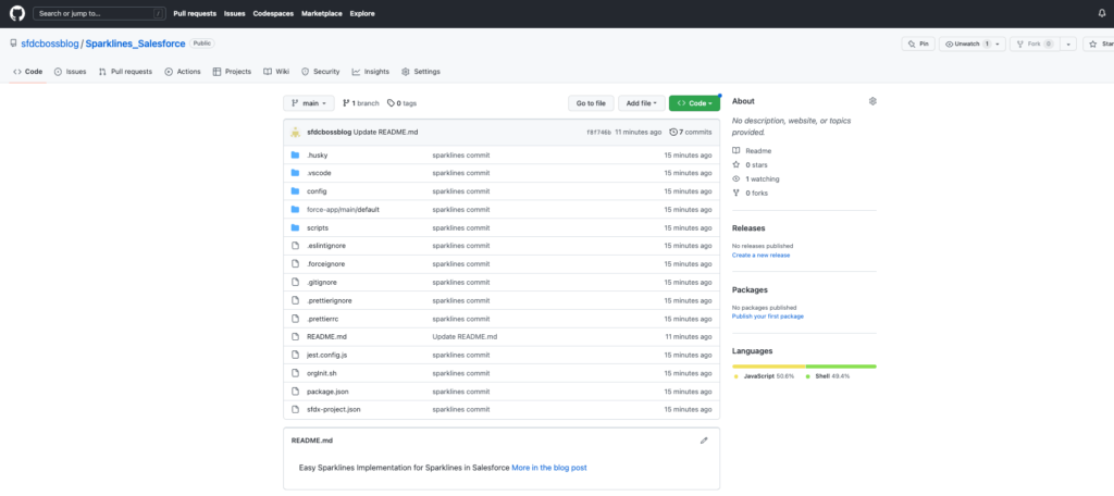
After
The source contains also:
- A Custom Object set of 12 fields that could alternatively be referenced for your use case.

